I won’t dive too deep right now. For those who need a simple blog, there’s no need to delve into the code and change anything there, but I must explain briefly. If you don’t like the default layout, the easiest way is to modify the template files and the stylesheet.
For example, if you don’t like the way an entry image is displayed on the page, you need to access a specific template file with the .html.twig extension of your theme via FTP and edit it. How to find the right template? It’s simple.
- Go to the admin panel → Pages → any blog page.
- On the opened page, go to the “Advanced” tab. If there are no pages, select the template yourself and then edit any. In my case, it’s “Item“.
- Access the folder via FTP at https:// your-site/themes/your-theme/templates (In my case, it’s striped.But if you chose another skeleton, the path and content of the template will differ.)
- Edit its content.
Just in case, I pointed out the location of the template selection on the screenshot.
When you open the template file, you’ll see the following. Everything marked with % include are external files that need to be reviewed to find the one you’re interested in. But I’m interested specifically in the image. Look at the screenshot.
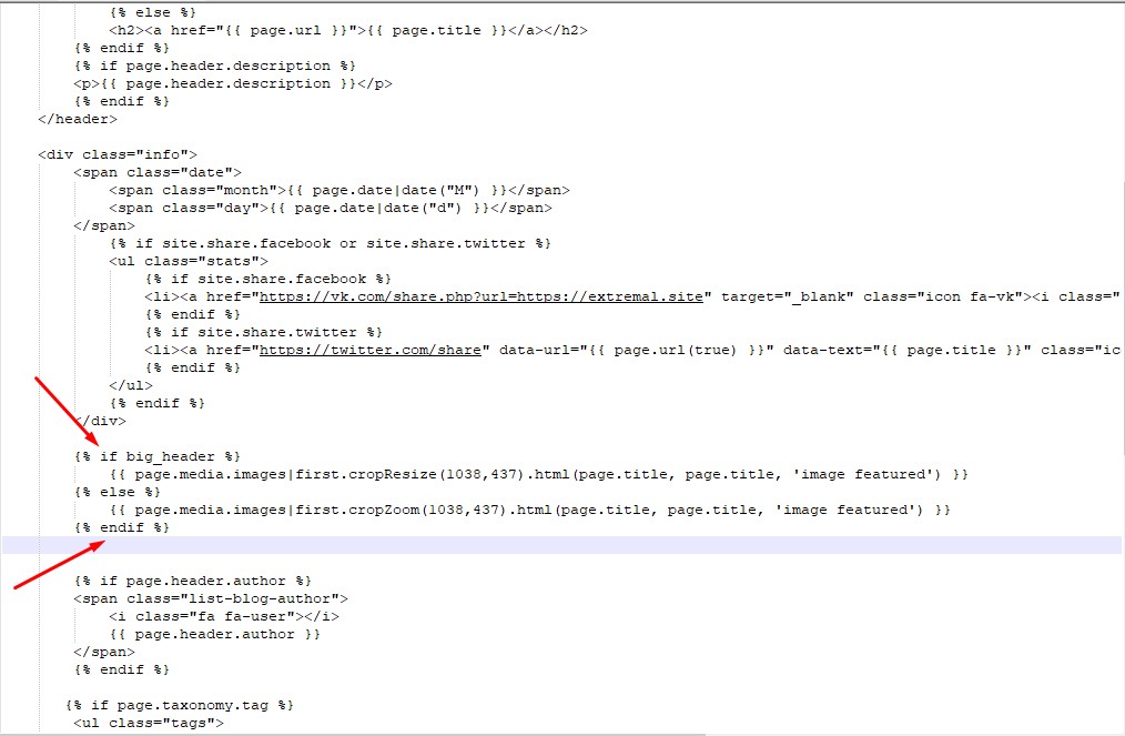
As you can see, there’s an included file partials/blog_item.html.twig, which is of interest. We’ve edited it once before, and now it’s time to do it again. Open it and find the line responsible for displaying the image.
Great, we won’t delete the old variable, just comment it out and make our own. Add the following lines:
{% if medium_header %}
    {{ page.media.images|first.cropResize(640,480).html(page.title, page.title, 'image featured') }}
{% else %}
    {{ page.media.images|first.cropZoom(640,480).html(page.title, page.title, 'image featured') }}
{% endif %}
Insert at the beginning <!–, insert at the end –> .
Done, now it’s time to change the variable responsible for displaying images. Go back to item.html.twig and find the necessary line.
Now replace the variable. The line will look like this:
{% include 'partials/blog_item.html.twig' with {'truncate':false,'medium_header':true} %}The result is visible, the image resolution has definitely changed. But not the size. Here the problem lies in the styles. In this theme, the image width is set to 100% for the area.
Therefore, no matter what resolution you set, the image will still fill the entire area. In the screenshot above, you can clearly see that the value we need is located in the stylesheet file main.css at line 1755. If you didn’t understand, look a bit higher and to the right of where the arrow points.
So, you need to go to your-site/themes/striped/assets/css and find the main.css file there, and in line 1755 find .image.featured.
Edit it, in the end, it will look like this:
.image.featured {
    display: block;
    width: 70%;
    margin: 0 0 2em 15%;
}
I reduced the image width to 70% and added a 15% left margin to center the image in the block.
It’s a bit rough, but I’ll fix it later. I hope you got the gist. As you can see, it’s quite simple to fix everything, the main thing is to approach the task wisely. In the next article, we’ll complete the blog to make it look decent.


